The UX in Marketing
Sep 21, 2018 10:51 · 1297 words · 7 minute read
Can we say that marketing and user experience design are two sides of the same coin?
I asked myself this very question until I started learning about UX and using it in practice.

My name is Kate Golovatyuk. I’m a marketing manager, and my aim is to learn everything that can potentially help me promote my company in the best possible way and define areas of improvement to satisfy our clients and become as attractive as possible to our future clients.
“Successful businesses figure out how to join business goals with user goals.” We call this value-centred design.
So, let’s say we know our target audience and what our potential clients want, but do we really know how to convey to them that we are exactly the company they are looking for? First of all, we interact with our potential clients through the website. So, this is the critical juncture where we can introduce our service to our clients.
Let’s say you have relevant and exciting content that answers all the essential questions about your service. Let’s say you also have a bright and snazzy design. Either of these are not very effective if you make your users “overthink.” I’d put it this way - you shouldn’t be making your users perform a number of actions to find an answer to a simple question.
To put it even more simply, don’t make users think! Or as Steve Krug wrote, “Don’t make me think”.
This book takes a common sense approach to break down the fundamental concepts in web usability. And I would like to highlight some basic patterns of user perception that I think every marketing manager has to have a solid grasp of. And the second book that I’m going to mention in my article is “Seductive interaction design” by Stephen Anderson, which has great insights on how you can create a playful, fun and compelling user experience.
Let’s start!
Why Seductive Interaction?
Stephen Anderson, in his book, successful tactics employed in attracting a mate also apply to interactions between humans and interactive devices. So, I think the same tactics are appropriate for marketers as well.
I would like to highlight a few ideas that I really resonated with and enjoyed. (However, I definitely recommend reading this book cover to cover).
So, here they are:
► Make your product desirable by providing its meanings.
“The danger is in confusing “ease of use” with actually desiring to use something. These are two entirely different things. Both are essential, but simply making something more usable won’t guarantee any more clicks or conversions. In this case, it was a psychology that made this so engaging.”
Building further on this thought, the author introduces us to the UX “hierarchy of needs” model that consists of six levels: functional - reliable - usable - convenient - pleasurable - meaningful. And if you want to create a revolutionary product, you need to shift from a bottom-up task focus to a top-down experience focus, but, without forgetting the basics of usability.
I would say that usability is indeed important - a revolutionary product should be not only easy to use or convenient but pleasurable and meaningful. How can we design applications that can evoke an emotional response in our users?
I caught myself thinking that I always try to put myself in my clients’ shoes before making an offer or creating an ad, etc.
From a marketing point of view, I would say it works the same way - until you explain the significance of your product and why your product answers a particular problem, the best- nobody is going to be interested in it.
► Be playful.
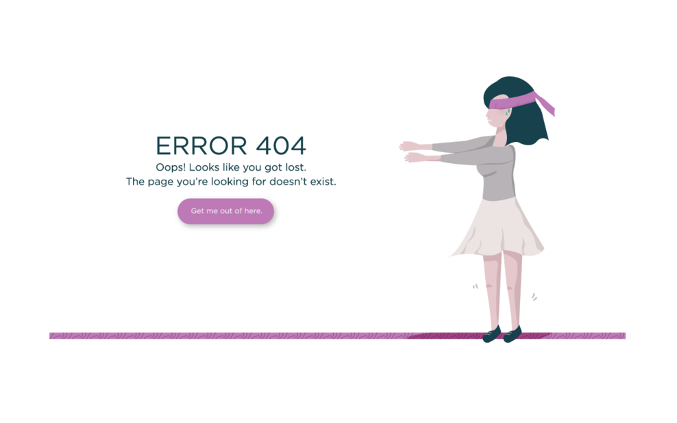
To be playful means to engage audiences with positive affective states such as humour. I’m sure that almost everyone would prefer an “Error page” with a funny illustration over a drab general page that says “Error 404”, plain, boring text.
Check out the example below, the first picture shows an annoying, run-of-the-mill error message, while the second one looks funny and enjoyable, even though both versions serve the same purpose.


I think the second example might at least make users smile a little bit.
“One study shows that our mental approach to sorting and rating information—how we categorise things—changes in response to our effect: when we’re in a good mood, we see more associations”.
In my opinion, the better way out in the situation with an annoying “Error” page is to create an exciting and playful design. Can we say that a funny design can impact our mood? Obviously, yes! Come on! You would at least crack a smile! And if you are in a good mood you’re more inclined to enjoy the product. Talking about associations, they are also important. As we know, associations make things more personal. And personality in turn, can make an interface feel more human and engaging.
So just as visual design can improve the perception of an interface’s usability, emotional design can have a similar effect.
So, the aims of marketers and UX designers are pretty aligned in some ways - This is why it might be useful to familiarise yourself with both of these areas. C onfirmation of that is the second book which I also highly recommend - “Don’t make me think” by Steve Krug.
Don’t make me think!
Here is an example of homepage creation tips that are related to both marketing and UX design:
► Web page should be self-evident. Obvious. Self-explanatory.
Let’s talk about the homepage. The structure of the page, the presentation of the information and the content, rest on the shoulders of a marketing manager. At least in my case, these are definitely all my responsibilities. Your homepage is your company’s face and so, it should include all essential information about your company and services; it should be self-evident and self-explanatory because it has a huge impact on your user’s first impression. And the main goal of a marketing manager as well as a UX designer is to make this page “self-evident” as I’ve mentioned above, but from “different sides”.
► When you’re creating a site, your job is to get rid of the question marks.
Absolutely. When I was creating our homepage structure and the content for our website, the main question in my mind was “What is the first thing our clients want to know about our company?”. And based on my experience, I created a list of these potential questions, answered the questions and then used this information for the homepage.
►What does your website say about your business?
There are several useful tips that can be used by marketers and UX designers that can help create a good homepage:
“The homepage has to: * Show me what I’m looking for; > * Show me where to start; * Establish trust.”
As I mentioned, the homepage has to include all the answers to potential questions, a suitable structure and a section that speaks about your expertise (portfolio, testimonials, etc.).
► The questions every homepage should answer.
“As quickly and clearly as possible, the homepage needs to answer the four questions I have in my head when I enter a new site for the first time: * What is this? * What do they have there? * What can I do here? * Why should I be here and not somewhere else?”
You can use it as a plan for your homepage. Actually, I did.
I want to conclude by saying that if you’re going to understand your clients better, you need to explore their behaviour from different sides. That’s why I think it’s important for marketers to be in close cooperation with sales managers, UX designers, etc. All this essential information could help you better piece together the “jigsaw”.